One of the most common questions I get from parents before Fine Art School Portrait Day is, “What should my child wear?” And good news: you do not need to go buy an entirely new outfit. (Unless you were looking for an excuse, in which case I fully support you.)
The goal of my Fine Art School Portraits is a little different from traditional school photography. I want to create a timeless portrait of your child that captures their personality and those tiny expressions you know so well. Their face should be the first thing you notice, not their shirt.
These portraits aren't meant to live forever in a forgotten folder on your phone or computer. They are created with printing, displaying and sharing in mind—framed on your walls, tucked into albums, sent to grandparents and kept as part of your family's story for years to come. Choosing simple, timeless clothing helps make sure the portrait still feels just as beautiful hanging on your wall ten (or twenty!) years from now.
So when you're standing in front of their closet on picture day wondering what on earth they're going to wear, here are a few tips!
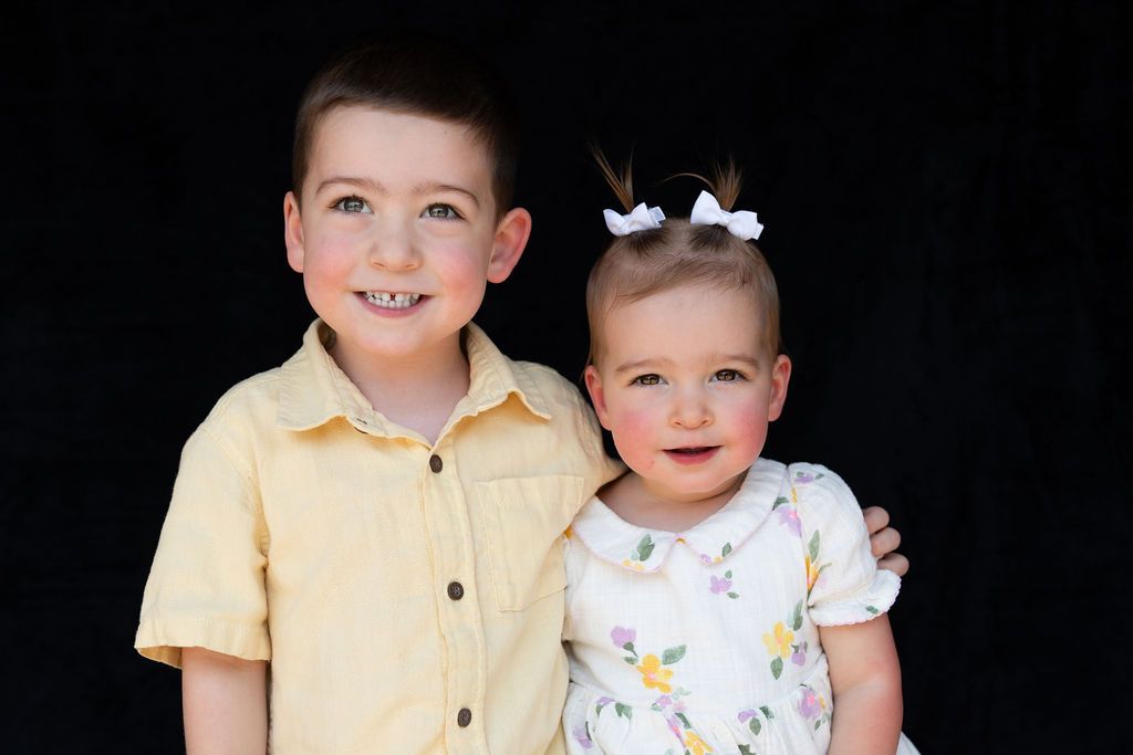
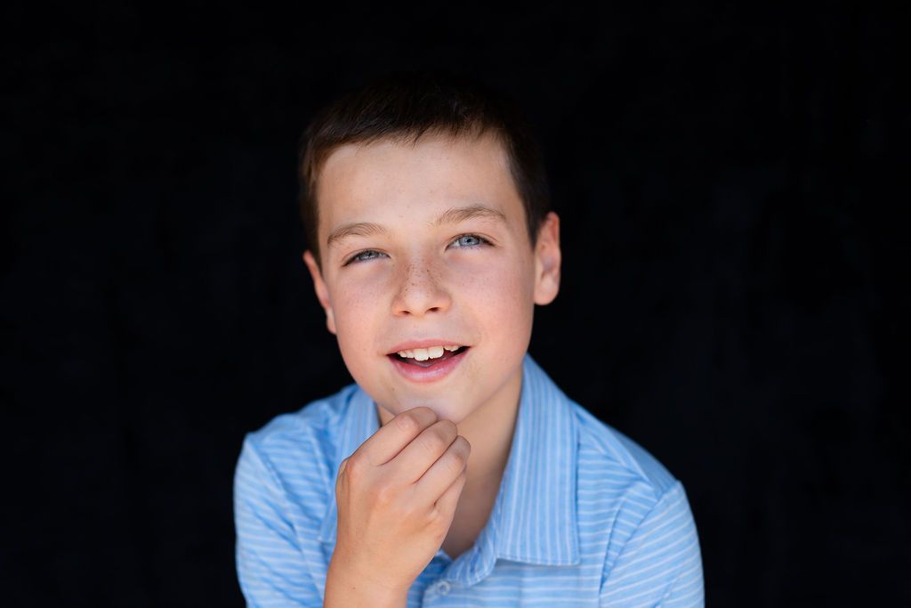
What Colors Look Best For School Pictures?
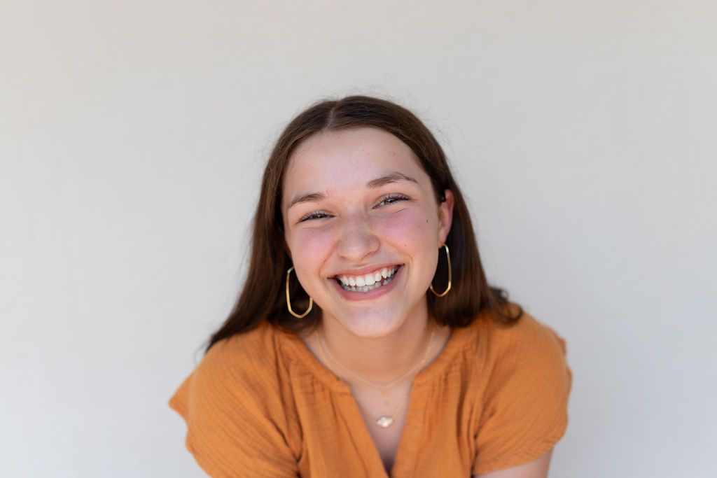
For fine art school photography, simple is almost always better. Solid colors, soft neutrals, earth tones and muted colors photograph beautifully and help keep all the attention where it belongs: on your child.
Think cream, oatmeal, dusty blue, muted green, rust, soft pink, burgundy, denim blue, warm brown or other subdued tones.
I recommend avoiding neon or extremely bright colors. Besides being distracting, intensely colored clothing can reflect light back onto the skin and create unwanted color casts—hello, neon-green chin!
Join My Community
Want priority access to limited sessions, early booking for seasonal offerings, and invitations to curated Adventure Days? Join my community to stay in the know!
What Should My Child Wear with a Black Backdrop?
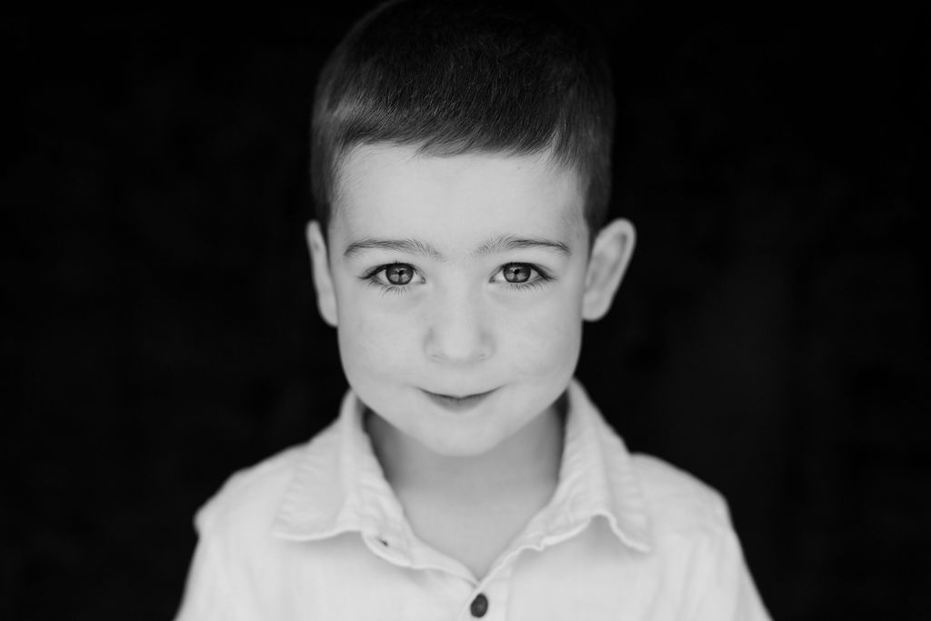
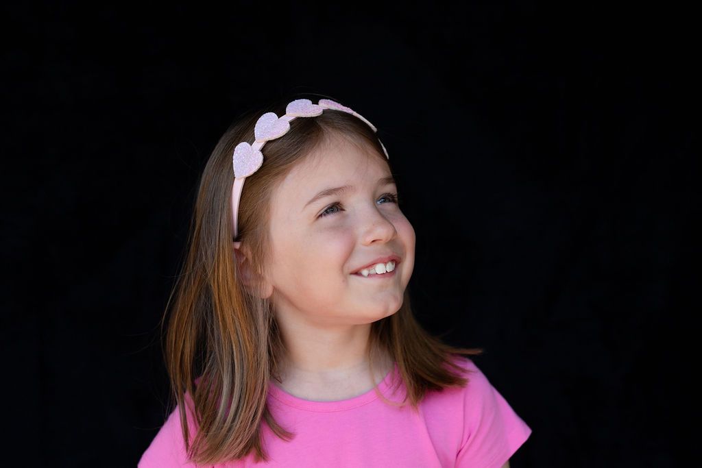
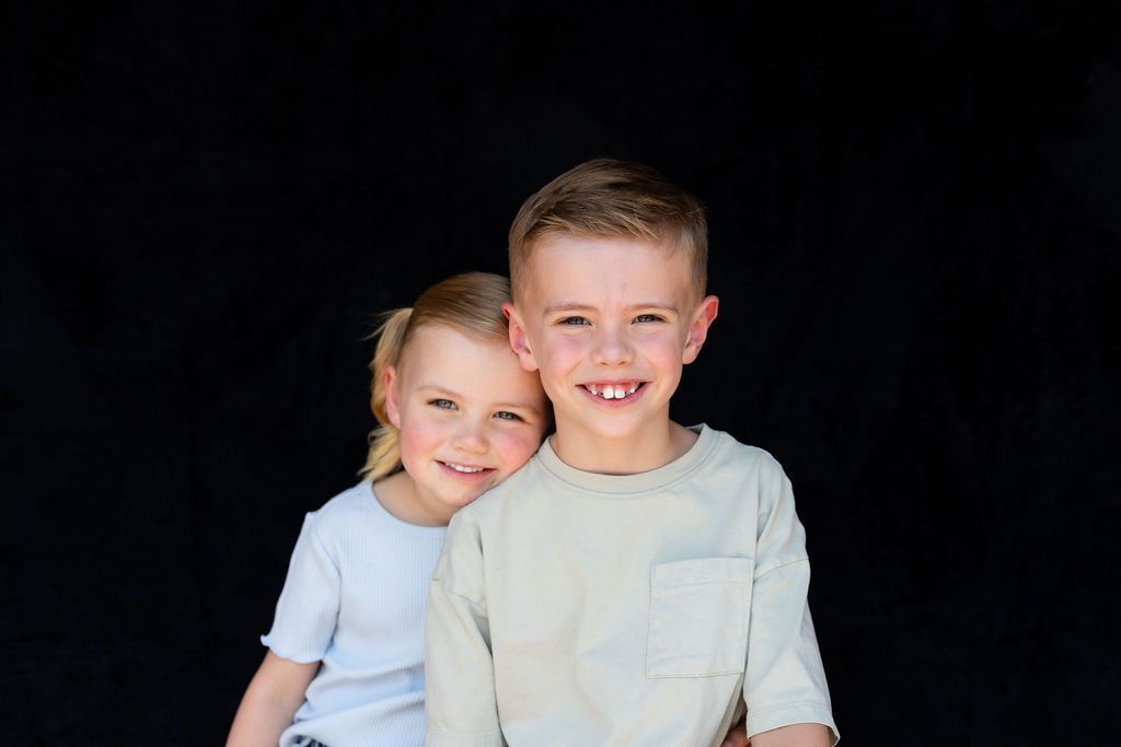
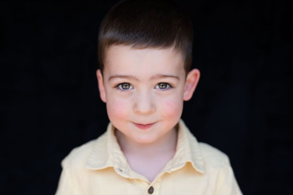
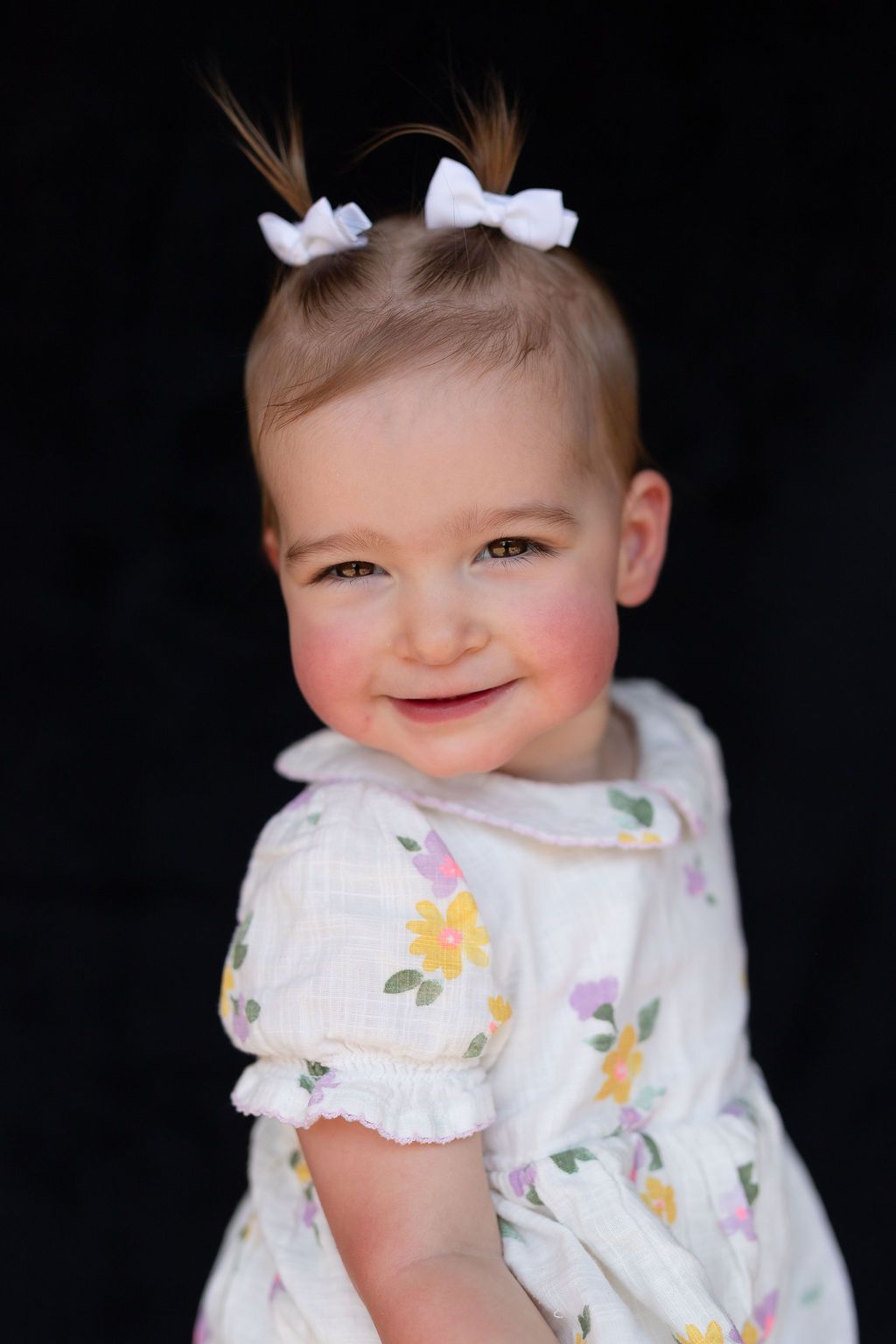
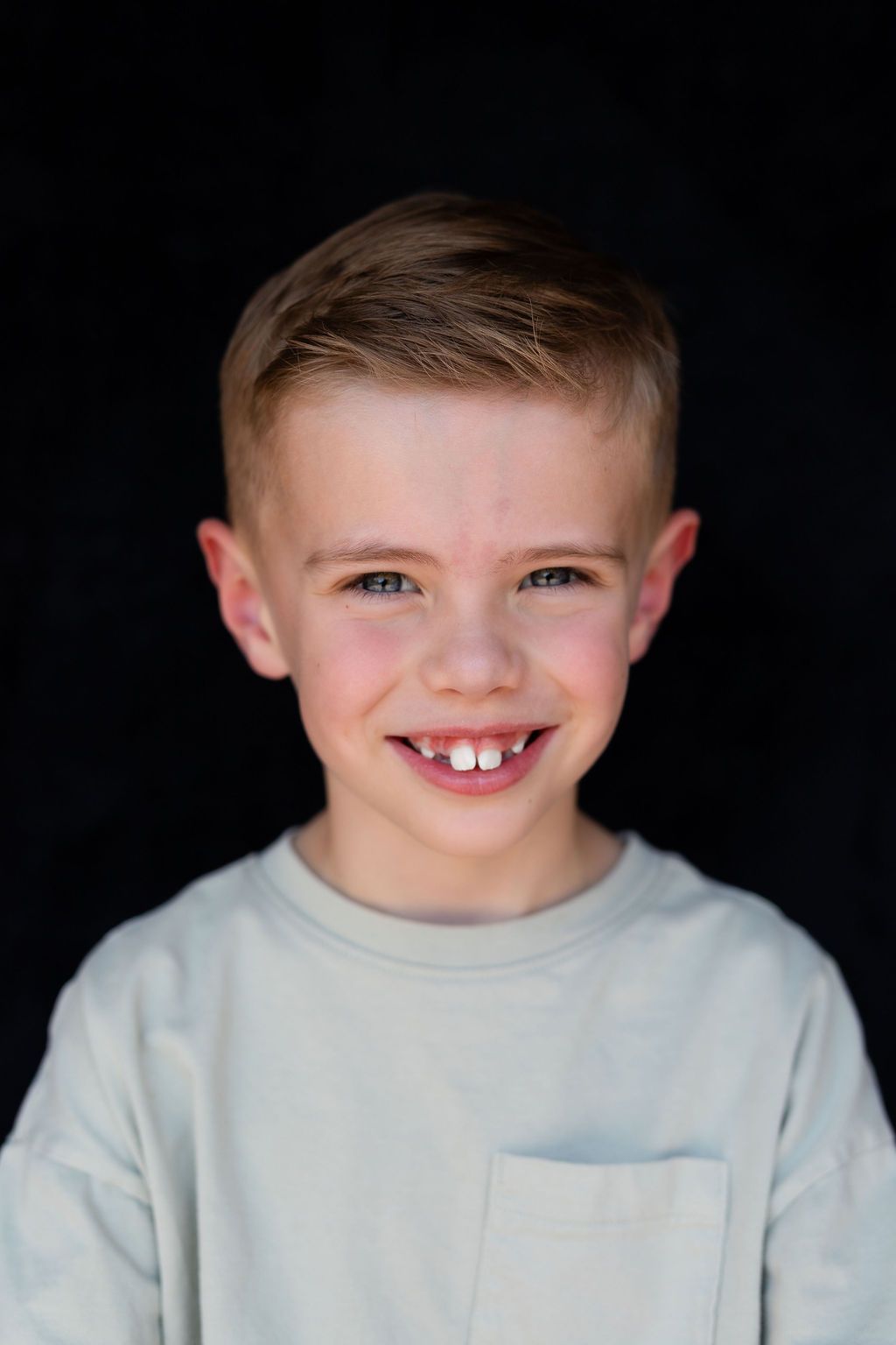
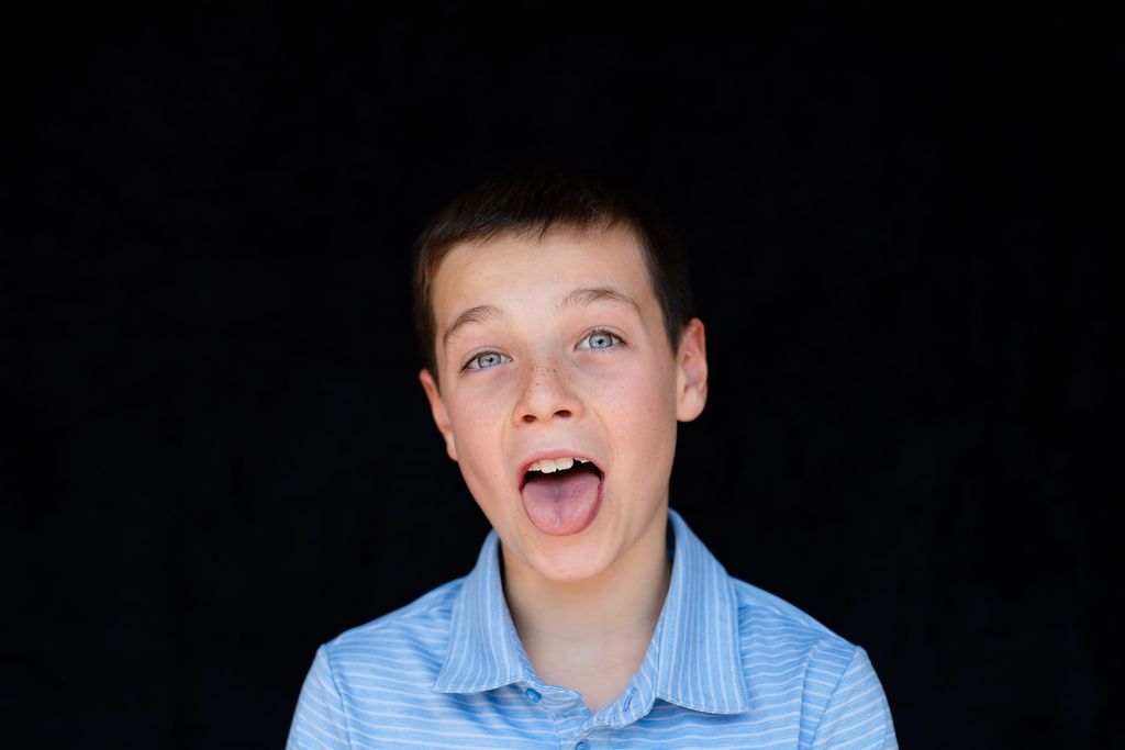
If your school is being photographed on my classic black Fine Art School Portrait backdrop, medium and lighter colors are especially beautiful.
Cream, camel, dusty blue, muted pink, sage, rust, denim and soft jewel tones all stand out beautifully against black.
I recommend avoiding an entirely black or extremely dark top because it can disappear into the backdrop, leaving your child's head looking like it's floating in space, which is probably not the timeless school portrait we're going for.
What Should My Child Wear with a Cream Backdrop?
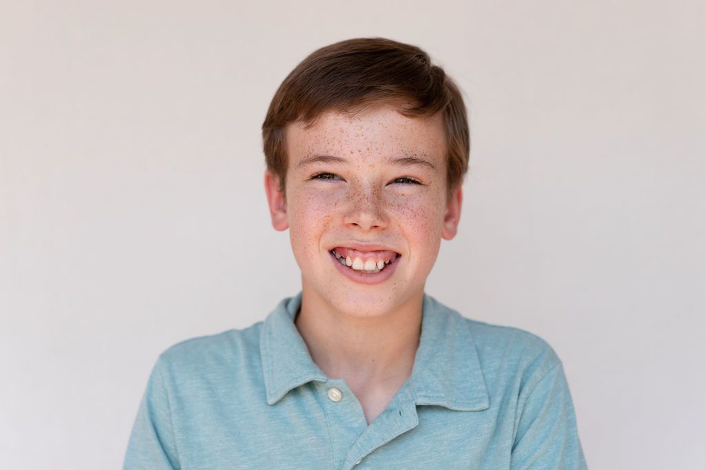
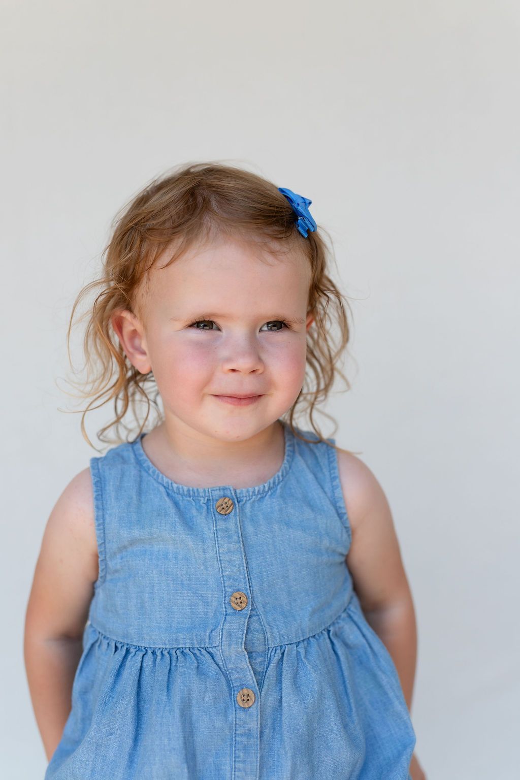
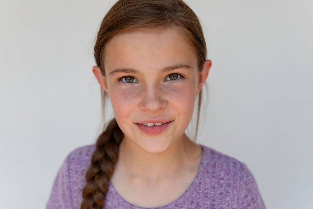
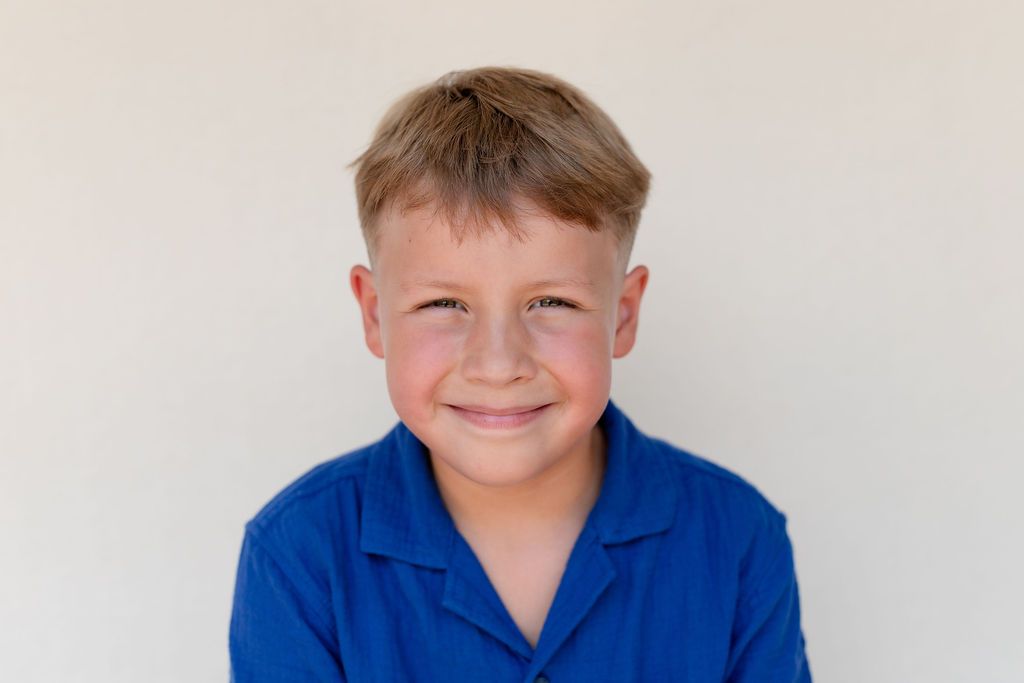
For schools using my cream Fine Art School Portrait backdrop, I love warm, muted colors that complement the softness of the background.
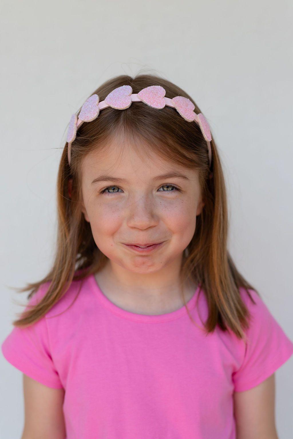
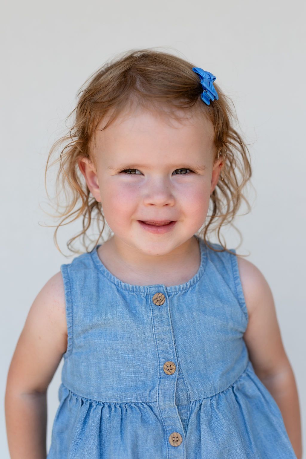
Think olive, dusty blue, muted burgundy, rust, warm brown, soft pink, denim and earthy greens. Cream and other light neutrals can also create a beautiful, soft tonal look.
Again, you don't need a fancy outfit. A simple knit sweater, classic dress, button-up, Henley or solid-colored tee can photograph beautifully.
Should Kids Wear Patterns for School Pictures?
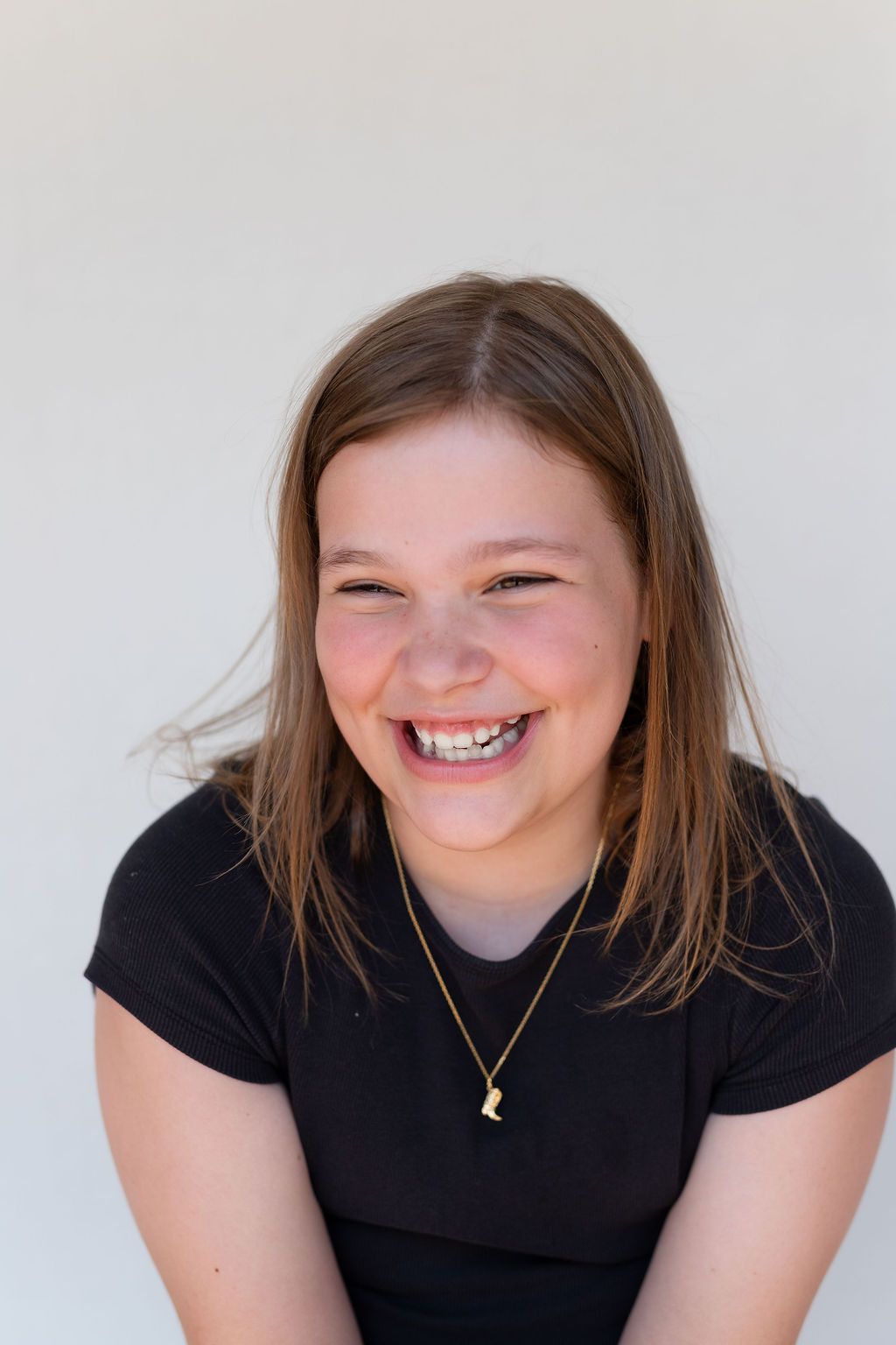
Small, subtle patterns can work, but I recommend avoiding large or busy patterns, big stripes, graphics, characters, words and visible logos. These elements naturally pull your eye away from your child's expression.
When in doubt, choose the solid shirt.
And above all, choose something your child feels comfortable and confident wearing. I don't want them worried about an itchy collar or a shirt they're afraid to move in. I want them relaxed enough to give me them.
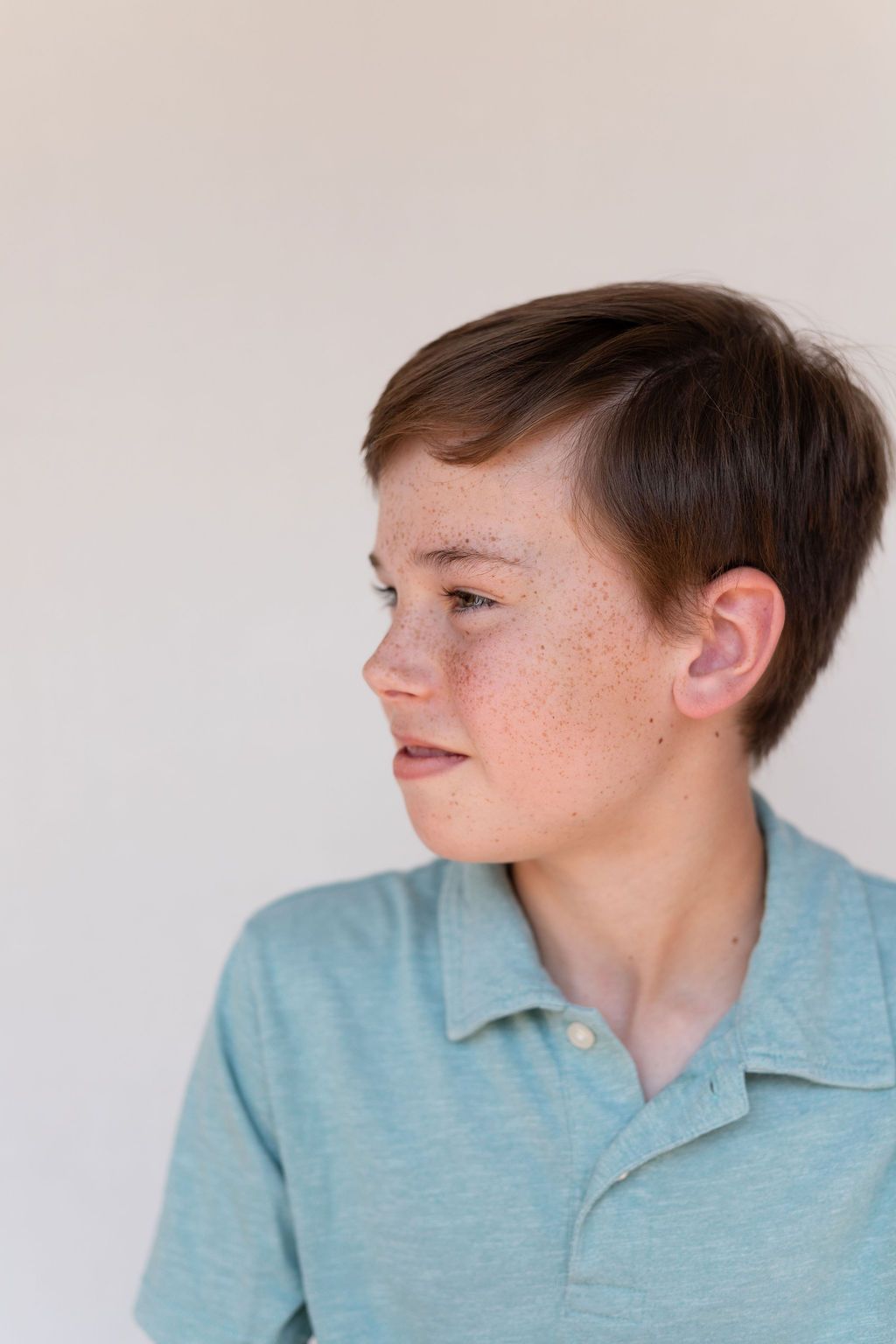
Because someday you probably won't care what shirt they were wearing in second grade. You'll care about that missing tooth. The little smirk. The freckles. The way their nose crinkled when they laughed.
That's what we're photographing.
Fine Art School Portraits are meant to feel classic, artistic and timeless—the kind of school photographs you'll actually want to print, frame and keep long after this particular stage of childhood has passed.

Let's document your story
If you want photos that capture your family exactly as you are, I'd love to create with you.